Case Study
Residential Real Estate Branding & Website Design
Downtown Brooklyn, NYC
Brand identity, website design, architectural renderings, and copywriting for a new 99-residence rental development in Downtown Brooklyn.
Visit site ↗The challenge
One Fifty Lawrence is a new residential development at 150 Lawrence Street in Downtown Brooklyn, with 99 rental apartments across 24 floors.
When the project came to Studio Heym through Rentopia, the building had no visual identity, no website, and limited architectural renderings.
The job was a complete brand and digital experience from scratch: a distinct presence for the property, and a convincing first look for renters at a building still taking shape.
The approach
Downtown Brooklyn never stops moving. A building there doesn't need to compete with that energy. It needs to be the calm place you come home to.
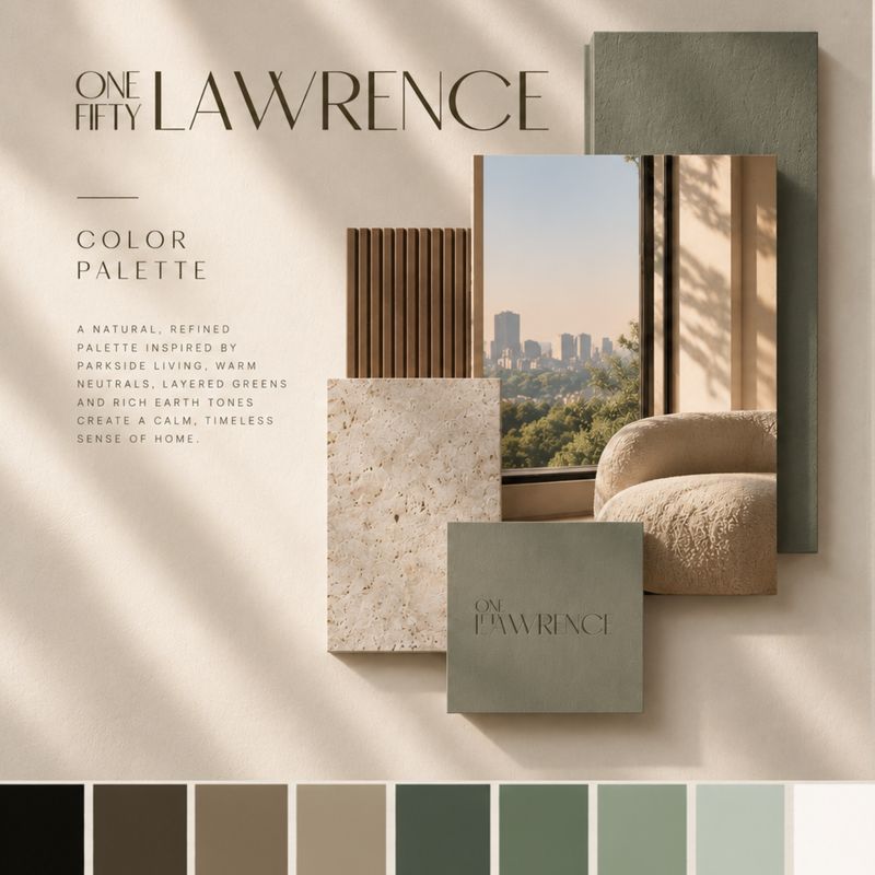
That idea shaped the entire creative direction. Soft sage, layered olive greens and warm neutrals set a calm, sophisticated atmosphere. Elegant typography, generous white space and a custom wordmark gave the brand its architectural character.
Rather than leaning on traditional luxury real estate language, we focused on how the building should feel. Considered, welcoming, and quietly elevated.
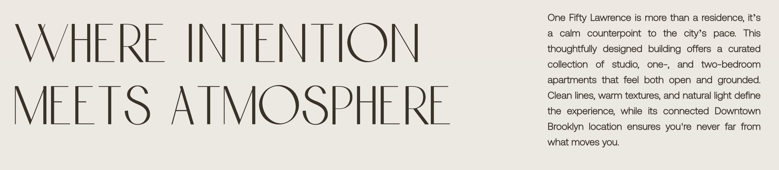
Where Intention Meets Atmosphere.
Brand identity & creative direction
Tall, hairline letters, with ONE FIFTY set small and stacked beside LAWRENCE, the way a number sits beside a name on a door. Quiet enough for a lobby wall, clear enough for a phone screen.


One mark, every color in the palette
Every color is named for something in the building.

Three palette directions went to the client. Urban Serenity became the brand: warm neutrals, layered greens and rich earth tones, each one pulled from a material in the building.
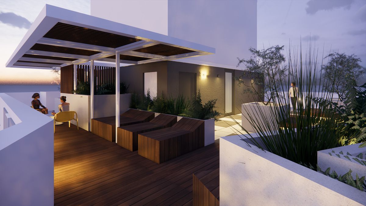
The renderings carry a soft purple tone from the dusk light. The palette was chosen to work with it: greens and warm neutrals that sit easily beside a lavender sky, so the brand and the imagery read as one.
A tall, fine display face for headlines. Babe Sans for everything that needs to be read.
Website design
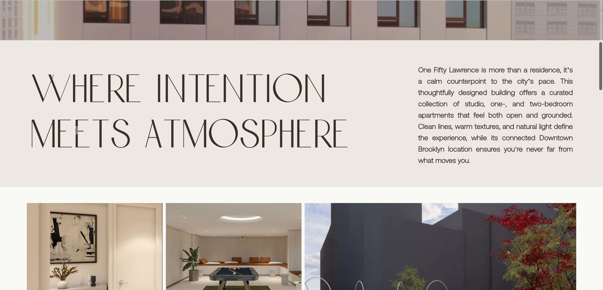
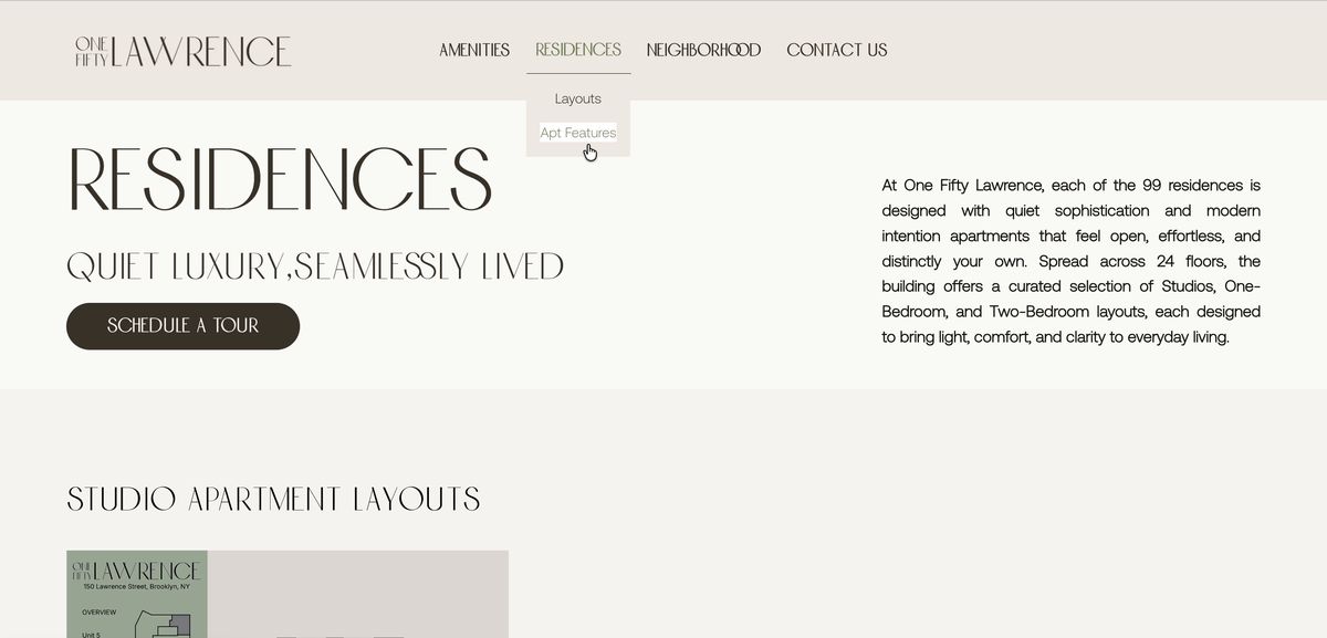
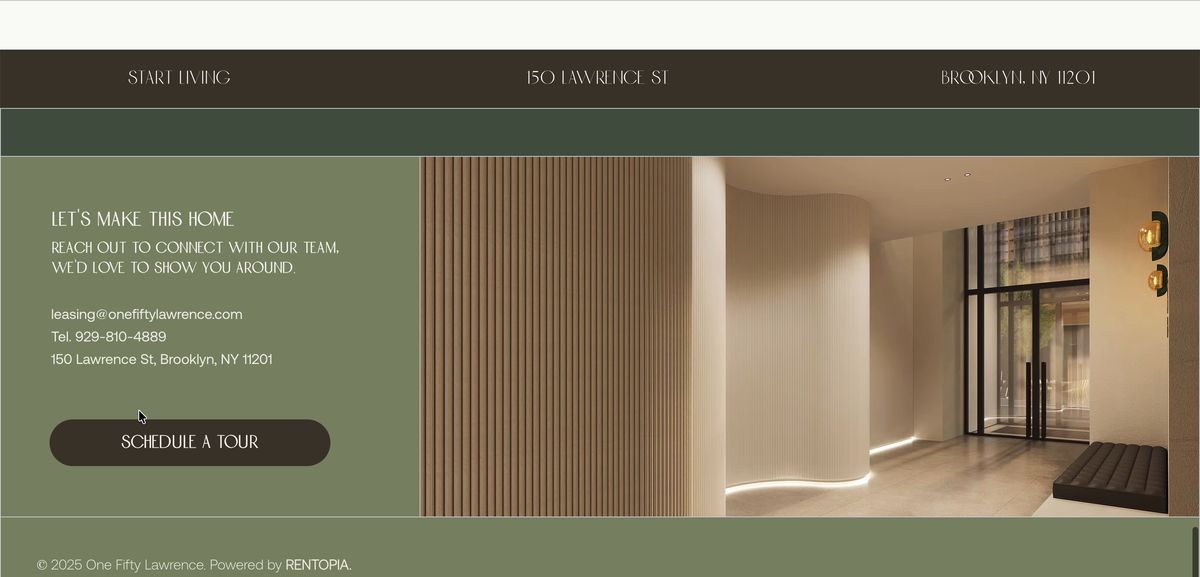
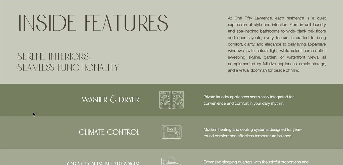
The website brings the brand to life through UX and UI design, original illustrations, architectural renderings and copywriting, all working as one system.
Every element, from the typography and imagery to the navigation and messaging, was designed to make the building feel tangible, desirable, and easy to explore.
Custom illustrations
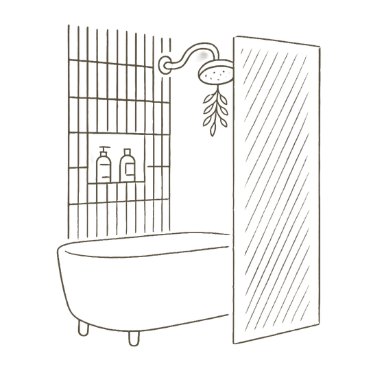
Hand-drawn icons for each apartment feature give the residences page personality and a consistent visual language.
Washer & Dryer
Climate Control
Gracious Bedrooms
Floor-to-Ceiling Windows
Custom Storage
Full Size Appliances
Wellness-Inspired Baths
Wide-Plank Oak Flooring
24/7 Virtual Concierge
Open-Concept Living
Wellness-Inspired Baths
24/7 Virtual Concierge
The same drawings in Shadow Taupe, for light grounds

Architectural renderings
With limited visual assets available, we created renderings of key spaces, so prospective residents could picture the property before completion.
The results
The website became the property's lead-generation platform, connecting a new identity with measurable leasing interest.
Together, the numbers show what a cohesive brand and a well-made website can do for a lease-up: carry someone from first impression to inquiry.
Measured 5 Jun 2025 to 4 Jun 2026 · the site's first year
You may also like
Branding, websites and signage for new developments across New York.
Branding · Website · Marketing Materials
Hudson Yards, Manhattan · Case Study
Branding · Website · Marketing Materials
Crown Heights, Brooklyn · Case Study
Branding · Website · Marketing Materials
Gowanus, Brooklyn · Coming soon
Branding · Website · Marketing Materials
Mott Haven, Bronx · Case Study
Branding · Website · Marketing Materials
Coming soon
Branding · Website · Marketing Materials
Coming soon
Website
Coming soon
Ready to start?
Tell us what you're opening, and when.
Request a Quote → Or see how our packages work