Apartment Building Branding: Beyond the Logo
By Alma Richter
A rooftop, a fitness center, beautiful interiors. Plenty of apartment buildings have them. So what makes someone remember yours?
In a competitive rental market, similar amenities and finishes can make properties difficult to distinguish. Branding gives a building its own identity, creating a connection with prospective residents before they ever step inside.
But apartment building branding is more than a logo and color palette. It's how a property looks, sounds, and presents itself, from its website and marketing materials to the leasing experience.
Start with what makes the property different
Every building has something worth paying attention to. Sometimes it's the architecture or materials. Sometimes it's the neighborhood, the intended residents, or the developer's vision. Usually, it's a combination.
The first step is understanding those qualities and finding a direction that feels specific to the property.
A distinctive brand doesn't need to be loud or elaborate. It needs a clear point of view, one that can guide everything from typography and imagery to website content and marketing.
Without that foundation, even a beautifully designed identity can feel interchangeable with the building down the street.
Think beyond the logo
A logo is one part of a much larger visual and verbal identity.
Apartment building branding brings together typography, color, imagery, illustrations, messaging, and layout into a recognizable system. Each element has a role, and together they establish the property's personality.
That system also needs to be flexible.
A building sign is experienced from the sidewalk. A brochure might be handed out during a tour. A website is often explored on a phone while someone compares several properties.
Each application serves a different purpose, but they should all feel like they belong to the same place.
Different properties, different directions
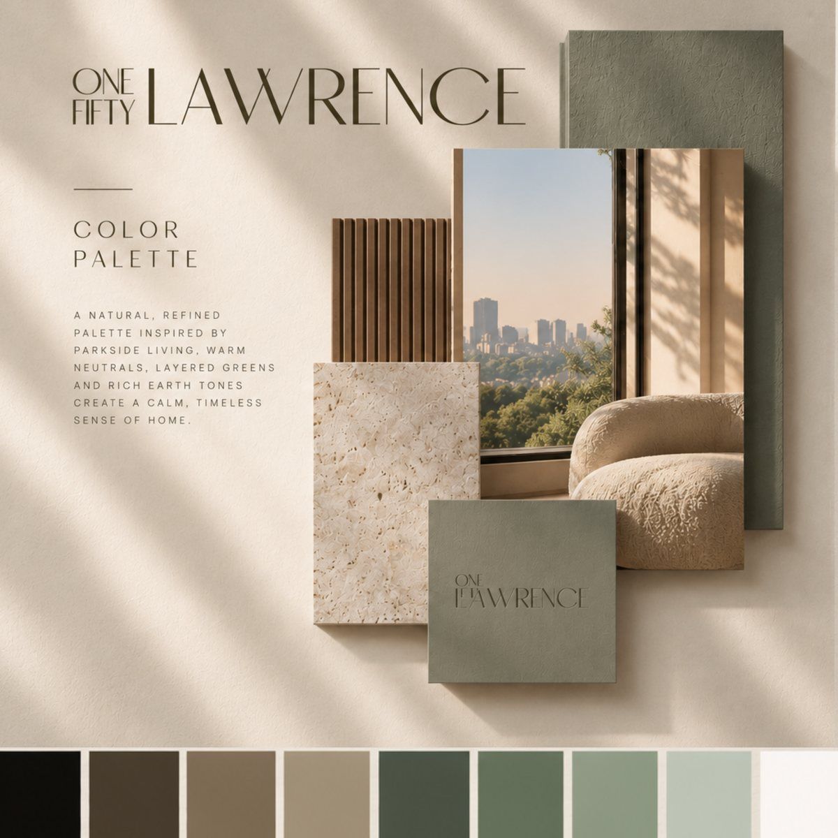
For One Fifty Lawrence in Downtown Brooklyn, warm neutrals, layered greens, and natural textures helped establish a calm, residential atmosphere. The identity carried through the wordmark, website, and marketing materials.
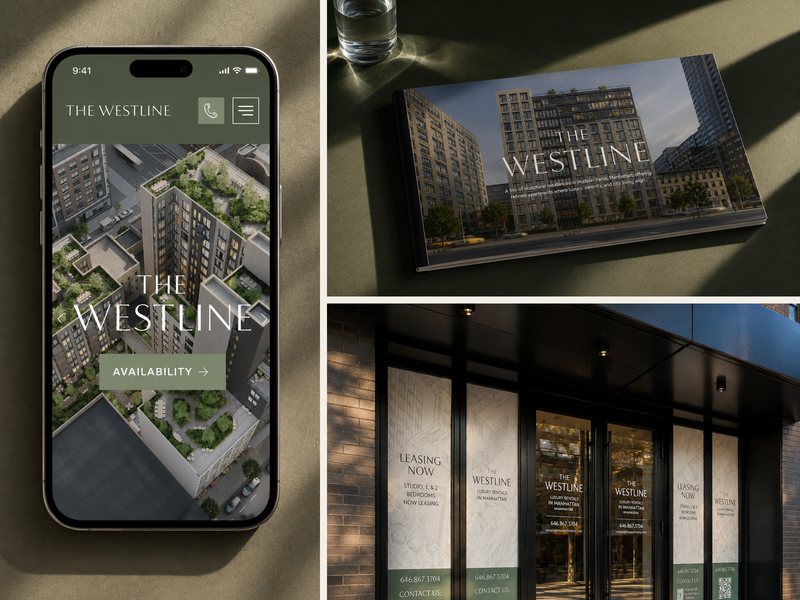
At The Westline, the challenge was different. Three residential buildings needed one cohesive identity that connected them while making the development easy to understand.
Neither project called for the same visual approach. The direction came from the property, not a predefined style.
Make more of the visuals you have
New developments often begin marketing with a limited collection of architectural renderings, floor plans, and material references.
Those assets are a starting point, not a creative limitation.
For The Cornice in Gowanus, Brooklyn, Studio Heym transformed a small set of renderings into custom line illustrations. Each was subtly blended into the background of a corresponding website page, with gentle movement adding another layer of depth.
The result gave the website more texture and personality without requiring an entirely new collection of visuals.
It's a good example of how thoughtful design can extend the value of existing assets while creating something distinctive.
Connect the brand to the leasing experience
A strong visual identity creates recognition. A well-designed website turns that recognition into a useful experience.
Prospective residents need to understand the property, explore floor plans, check availability, and know how to schedule a tour.
The brand should support that journey, not get in its way.
This is why branding and website design work best when considered together. Visual storytelling establishes the atmosphere, while clear navigation, useful information, and thoughtful calls to action help visitors take the next step.
The same thinking applies to brochures, signage, social media, and other marketing materials. Every touchpoint should feel connected while doing its own job.
A brand that belongs to the building
The most memorable apartment building brands aren't necessarily the most elaborate. They're the ones that feel considered and specific.
A particular illustration style, a thoughtful use of color, a consistent tone of voice, or a website that reflects the architecture can all contribute to that recognition.
The goal isn't simply to make a property look beautiful. It's to give it an identity people connect with, one that stays consistent across its marketing and supports the leasing process.
At Studio Heym, we create branding and websites for residential real estate developments, bringing creative direction and practical leasing needs together from the start.
Explore these projects: One Fifty Lawrence · The Westline · The Cornice